
The About Us page is one of the first and most important pages to build on an ecommerce website.
It’s a page that explains who you are, what you do, and what customers can expect from your brand.
For ecommerce businesses in particular, the About Us page should be anything but a placeholder. This critical section should be a place to answer pressing questions, a catch-all for recent highlights, and a space to explain company goals, mission, and overall impact.
Let’s explore 10 tips for constructing a successful About Us page, followed by some great examples from other websites in the ecommerce industry.
Start selling online now with Shopify
Start your free trial

10 tips for creating a successful ecommerce About Us page
The About Us page will be one of the most popular pages on your website. Besides curious visitors, the page will be visited by media professionals, leads, and potential brand partners. As such, it’s important to get it right.
Following are some best practices for creating a unique About Us page.
1. Make it look and sound like your brand
The About Us page should reflect your brand’s personality. This means aligning all copy, images, and other elements with your brand guidelines.
It may be helpful to run your copy through TTSReader to find broken sentences or off-brand content. Otherwise, don’t be afraid to cut anything that just doesn’t work.
2. Don’t neglect your SEO
This means including relevant keywords about your brand and what it does. You can turn to tools like Ahrefs for this, or even Google Analytics.
Just make sure not to keyword stuff, which could negatively affect your SEO rankings.
3. Add diverse media
Text is not enough for the average About Us page. To genuinely capture your visitors’ attention, you need to include a combination of pictures, videos, graphics, and animations.
For most ecommerce companies, embedded slideshows are a great place to start.
4. Write for the search intent
When users type your brand into the search bar, what are they looking for? While you can’t always know for certain, you can rise to the challenge by writing for the search intent.
Start by weaving in basic facts about your business, including the year established, products offered, and business type. From there, expand into other relevant categories such as brand affiliations and company news.
5. Provide internal links
Internal links are critical for helping visitors find what they’re looking for.
Link your About Us page to individual products, categories, or pages for trending items.
6. Beef up the length
About Us pages shouldn’t just fill up space. However, densely packed pages can decrease bounce rates and improve visitors’ connection to your brand.
Many ecommerce companies create About Us pages that explore their history, products, and even influencers. Some of the largest stores include a list of charities, beliefs on sustainability, or even opt-in forms for weekly deals.
7. Add some FAQs
If you don’t already have an FAQ section of your website, try adding it to your About page.
This is helpful for two reasons. First, visitors can answer all their questions in one convenient location. Second, your page will likely match the user’s search intent.
8. Highlight important stats
The About Us page isn’t just about your brand’s accomplishments. Highlighting your biggest achievements is always beneficial. You won’t just be impressing your customers—you’ll show the world how powerful your brand has become.
Try starting with hard numbers such as customers served, transactions made, or products sold. You might also want to include industry-specific stats, such as your sustainability measures and their impact.
9. Add a call to action (CTA)
CTAs have a place on every web page—and the About Us page is no exception.
Simple buttons like Shop Now or Browse Catalog are a great place to start.
10. Talk about the product
Your brand’s history and achievements are only part of an About Us page. It’s important to include your unique selling proposition, particularly if your products are one of a kind.
You may want to provide an infographic that breaks down your products’ ingredients, materials, or structure. If possible, add a section that discusses each type of product your company offers (with inbound links to each).
6 examples of successful ecommerce About Us pages
No two About Us pages are alike. However, the elements they include will share some similarities in terms of structure and function.
Whether you’re using a webpage generator or building a page from scratch, it pays to follow great About Us page examples while building your first layout.
This includes the examples provided by these top companies:
- Colourpop
- Fashion Nova
- Gymshark
- Fan Gamer
- G FUEL
- Allbirds
1. Colourpop
Cosmetics brand Colourpop is all about transparency—something that’s immediately reflected on its About page.
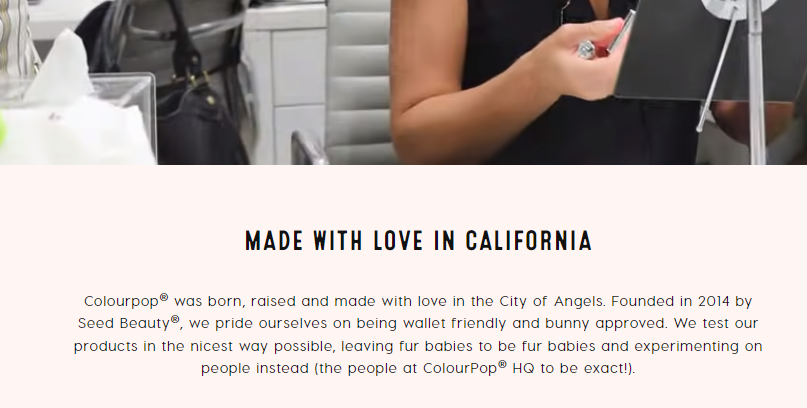
The page begins with a video followed by a description of the company’s objectives, age, and sustainability beliefs. Notice that the content stays on-brand even while discussing serious topics.
From here, the content seamlessly transitions to recent awards, then merges with some reviews and testimonials. This is the website’s biggest strength: building a connection to customers from a first-, second-, and third-person perspective.
The bottom of the page links to each of the company’s product segments, then ends with a clear CTA to sign up for its newsletter. This is a great example of how all elements of the About Us page should point toward the same objective: netting more sales.

2. Fashion Nova
As a cutting-edge fashion brand loved by millions, Fashion Nova begins its About Us page with a simple idea:
“UNAPOLOGETICALLY SEXY. OBSESSED WITH BEING THE FOREFRONT OF FASHION.”
There are clear sections for each major idea—brand history, brand mission, and brand story. Although these are largely based on text, you’ll notice that a few images are inserted before every new idea.
The punchy finish here is an interesting one. The company adds a detailed section regarding its influencer community and provides a button prompting visitors to follow Fashion Nova on Instagram.
This shows that an About page’s CTA doesn’t have to be Buy Now.

3. Gymshark
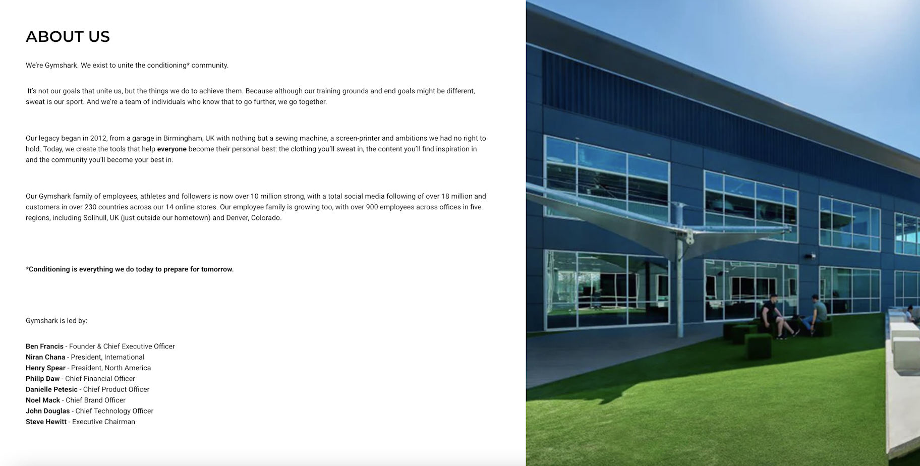
The Gymshark About Us page has three major sections: the story, the company values, and links for media inquiries.
The company’s story takes a moment to acknowledge its leadership team, which allows visitors to familiarize themselves with the human aspect of the brand and its mission.
This is a great reminder, even if you’re a company of one. Putting a face to your ecommerce brand can be a great way to foster human connection.
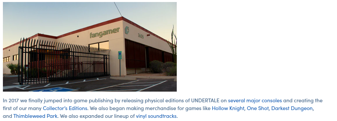
4. Fan Gamer
Fan Gamer is a site for fans, by fans. Its About page specifically references video games and pop culture references that its audience would recognize. This builds a great rapport with visitors and really shows off its brand voice.
Although the page is mostly text-based, Fan Gamer uses a variety of in-page links to direct shoppers to the right location. It appears very intent-focused without being overwhelming, which helps interested visitors continue their buyers journey without friction.
Fan Gamer reminds us that we don’t need to be fancy or splashy to make a good impression, especially if you know your target audience.
5. G FUEL
Titled “Our Story,” the G FUEL About Us page is extremely eclectic. A static image announces its position as the official energy drink of eSports, which is promptly followed by an introductory video.
The text-based portion of G FUEL is small—in a good way. As its main audience consists of gamers and visually driven customers, the decision to opt for a shorter page is ingenious. And since visuals are 60,000 times more powerful than text, it’s simple, accessible, and cost-effective.
To know thy audience is to know thyself. G FUEL does an exceptional job of both.

6. Allbirds
Sustainable shoe company Allbirds puts a heavy emphasis on its commitment to Mother Nature. Its About Us page is both informative and memorable, providing detailed information about what the company does and how it began.
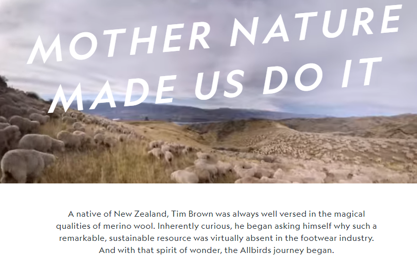
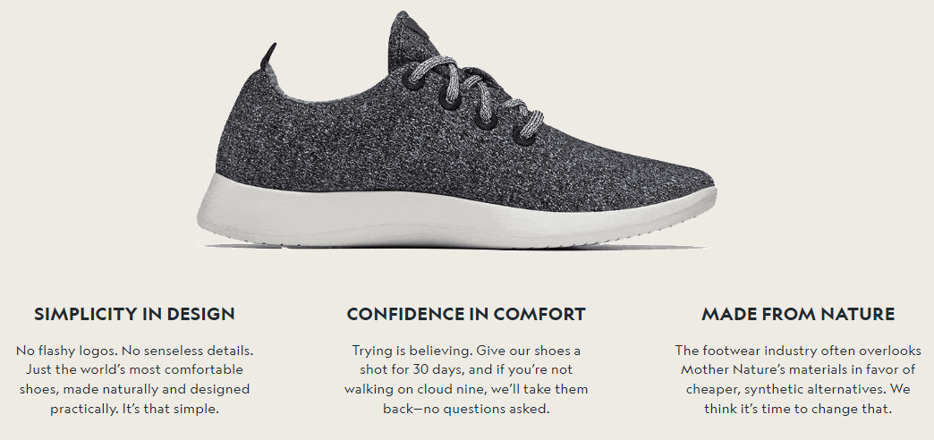
To double down on its USP, Allbirds includes a full animation of their project at the bottom of the page. This breaks down the most important elements of their shoes, including their design, comfort, and cash-back guarantee.
Ecommerce companies would do well to follow a similar strategy regardless of their vertical. Add animations and include topical bullet points that reinforce your unique selling proposition.
Implementing new features on your About Us page
Learning about best practices is all well and good, but when it comes to seeing success on your About Us page, you need to start implementing changes immediately.
If you already have an About page, do what you can to modify the content in light of these tips. While you can’t and shouldn’t change your style to reflect everyone else’s, at least try to update anything that might fall outside best practices.
If you don’t already have an About Us page, now is a great time to create one. Remember to build each section out slowly and begin with just one element at a time.
In either case, the work you put into your About Us page today will pay dividends tomorrow. Start treating it like a valuable asset to see real value from your efforts.
Start selling online now with Shopify
Start your free trial


Want to learn more?
- 5 Online Businesses to Start in This New Economy
- How to Reduce Shipping Costs So You Can Increase Profits
- 21 Daily Routine Examples To Prevent Going Stir Crazy At Home
- Brand Awareness: 6 Tips for Creating a Powerful Brand Strategy