In today’s digital world, having great product shots are essential to a brand’s success. Whether they are for grabbing the attention of buyers on your RangeMe profile, or driving D2C sales on your website and social media, how you visually showcase your products to the world should be a key component of every brand’s marketing strategy.
But what exactly is it that goes into capturing these images, whether they are pure product shots in front of a white background, or lifestyle shots in a variety of settings? To answer this question, I spoke with my friend Larry Shore of The Shore Shot to get a behind-the-scenes view of what went into the photos he recently shot for Daisy Betance, Founder of RangeMe subscriber Little Buddha. Below, he’ll walk us through his vision and setup for some of the product photos from the shoot for Little Buddha’s various digital platforms, with some guidance for brands that might look to shoot their own product photos. But first, a little about the brand…
A holistic approach to skincare

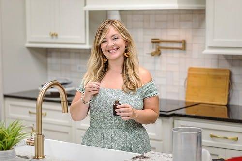
Little Buddha is committed to promoting a holistic approach to skincare that encompasses both the well-being of our planet and the well-being of our minds, bodies, and souls. Its brand values are rooted in eco-friendliness and mindful self-care, reflecting its dedication to sustainability and nurturing the overall well-being of its customers.
Its commitment is reflected in the use of all-natural and organic ingredients, pure essential oils, and eco-friendly packaging, and the brand offers a diverse range of self-care products, including triple whipped body butters, bath bombs, lip balms, CBD products, and facial and beard serums. “Our collection is handcrafted to cater to various aspects of your self-care routine, ensuring a comprehensive and rejuvenating experience for both body and mind,” says Betance.
Betance’s goal in working with Shore was to use the photos for upleveling marketing on social media as well as on her newly updated website and on her RangeMe profile. In addition, she plans to use the lifestyle images for email marketing campaigns.
The collaboration
To get things rolling, Betance sent Shore several product samples and they had an introductory call to discuss her goals for the shoot. “When we had the Zoom call Larry already had some sample shots using my products with a variety of lighting and backgrounds for me to review and give him an idea of what direction he should take,” says Betance.
The goal was to complement her existing product shots with more lifestyle images that showcased movement. He had several areas of focus:
- Vibe: Emphasis on natural; lighting should lean warm unless cool is used for contrast. While it didn’t need to be pristine, it couldn’t look too cluttered, either.
- Environment: Nothing too clinical. Reference an outdoor feel without being too campy. Highlight that the ingredients are clean and natural.
- Additives/support props: Implied water in imagery was ok, but no droplets on products.
- Palette: Props used can be contrasty but the scene should be complementary to product design and label
They decided that the shots should convey action with a more “real world” appearance. Since many of the products were from Little Buddha’s Woodsman line of men’s products, the shots should convey a masculine feel. “We wanted some shots to include a hand model,” says Shore. “We’d use minimal props but a reactive display environment, and decided to just focus on one product per photo.”
Below, Shore walks us through four of the product shots and how he achieved them, with some commentary by Betance.
Soaps

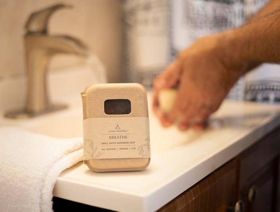
Shore: I used my home bathroom as the setting. Since it was a tight shooting set up, I started with an 85mm (f1.4) lens for some compression and deep softening of the background. In subsequent shots, I opted for my 50mm (f1.8) to get tighter, while being able to display enough of the background to show the sink. I explored many positions with the product in and out of the package and using supporting rigs to prop up the packaging, including with and without bubbles or soap froth.
The action shots required a set timer on my camera so I could use my own hands for “washing up” in the background. This required many takes, as hand position is crucial to show scrubbing movement without the photo looking too staged. The key was to make sure the products are showcased and focused with a gentle inference of its usage. I used multiple lights for both direction and shadow fill (2 x speedlight, large white flag, and overhead incandescents).
Betance: I loved the soap shots in the bathroom with a person in the background, as most of my photos are just of the products themselves. This gave a great real world vibe. The shots with the soap bubbles were super unique.
(You can view some of Shore’s photos among the images on these pages: Breathe Soap, The Woodsman’s Soap)
Sprays and creams
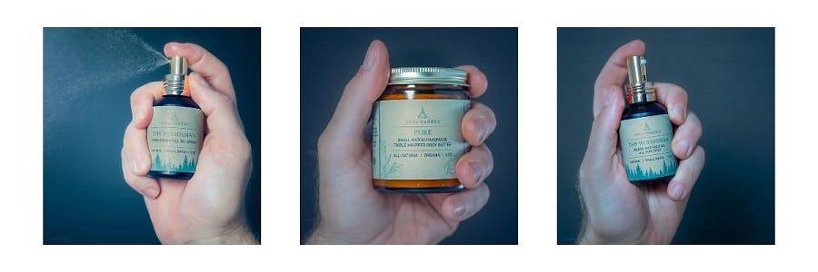
Shore: For this shoot I had three products to display: a spray, an oil dispenser, and a cream jar. The oil dispenser supplies droplets to be applied for softening a beard, but no fast action. Same is true for the jar of cream (which I now use daily!) I considered making these items actionable in a photo, but after some exploration, the imagery looked forced.

I then turned to the spray, where a spray-mist shot would be ideal to convey motion and usage. I opted for a more studio-type approach and rigged a black backdrop with foam core then added complimentary lighting, which had to both connect with the product label and sidelight the droplets once sprayed. (I staged a catch station out of frame for the droplets to fall due to the many spray attempts required). The black foam core absorbed some light so an additional fill was used underneath to bounce light back into the hand-shadows.
Once I had some “lit spray” options, I brought the raw images into Lightroom to explore white-balance. My original approach leaned warm (approx 5600k) as I want to share the same tone of the soaps. But these sprays and creams have a more stoic, soldier-like, feel. They are functional to protect against odor or act as a barrier to protect your beard and skin. They “feel” cooler, so raw images were brought down to 3200k creating a stronger image combined with the hand grips. (Grip position also had to be experimented with to look less staged but with a reasonable pose.) Additional effects and post-processing were applied to further the background and isolate the product. All items in this category were shot at 50mm
Betance: I loved the uniqueness of the spray mist shots, and the stark dark background in these shots, which highlight the products well.
(You can view some of Shore’s photos among the images on these pages: Woodsman Beard & Face Oil, Body Moisturizer, Woodsman Essential Oil Spray)
Organic lip balm

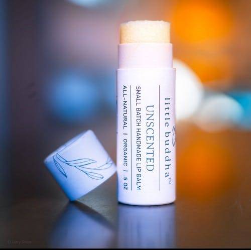
Shore: For the lip balm, I explored actual lip usage, but it gave a sense that was almost too intimate for the goals of the shot. Instead, I opted for a cleaner approach of the isolated product but complimented it with more fanciful background color and lighting, using a 50mm lens to maintain realistic dimensions.
Only static light and a white fill flag were used, with the background diffused. I had some challenges positioning the products, as cylinders cannot be flattened to view the whole label, so a balance was needed to sacrifice some visible logo with clear text on the label. In Lightroom, I added a touch of turquoise to the shadows as well as some sharpening for the label.
Betance: This ended up being a fun and unique shot, particularly great for social media.
(You can view some of Shore’s photos among the images on this page: Organic Lip Balm)
Shore’s footnote on lenses
The 50mm focal length is commonly considered similar to what the human eye sees in relation to distance, distortion, and compression. It is not uncommon this length is used for products so the consumer has a realistic expectation.
The use of 85mm lenses is often for portraits as it has the most flattering compression and least amount of distortion on the human face, but it can be leveraged for productions provided it is at a proper distance to limit compression. (Compression being the perceived visual difference between the foreground and background.) This also not to say other focal lengths can be used successfully for a given artistic direction (ie. 100mm for marco)
Editor’s note: Larry Shore can be reached at larryshore@theshoreshot.com
The post Behind the Scenes of a Professional Product Photo Shoot appeared first on The RangeMe Blog.