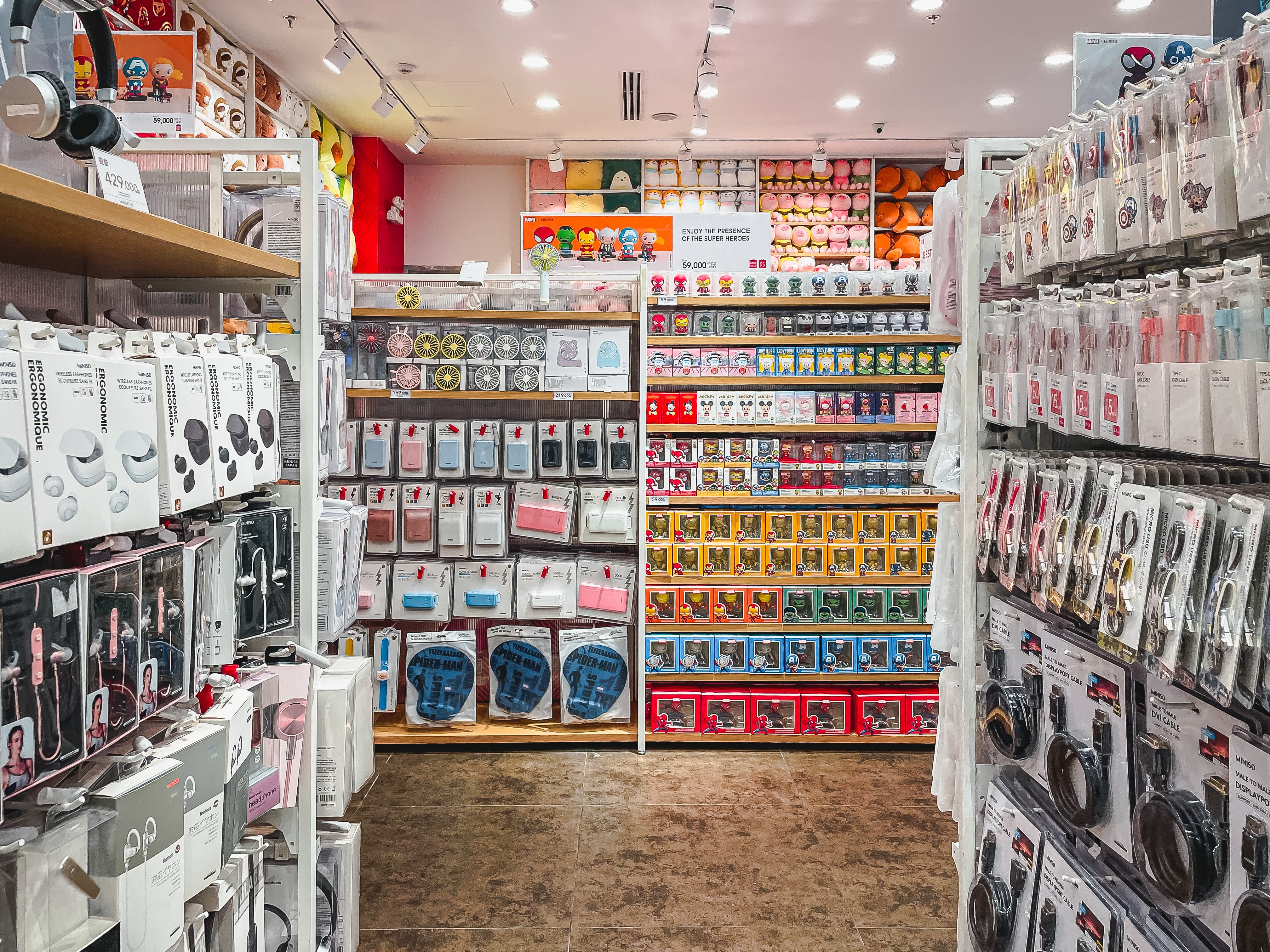
Quality products matter, but how you showcase them matters more. Enter visual merchandising: the key to captivating your customers with enticing product displays. It’s the new frontier in retail, where attention to detail and presentation excellence can set you apart from competitors.
Unfamiliar with visual merchandising? Don’t sweat it. This guide will break down what it is, highlight its various forms, and give you tips for setting things in motion.
Start selling online now with Shopify
Start your free trial


What is visual merchandising?
Visual merchandising refers to the strategic arrangement and presentation of products. This process shines a spotlight on their key features and benefits, drawing customers in and compelling them to make a purchase.
Step into any successful retail store. The sleek product displays that greet you aren’t just thrown together. Each item is thoughtfully positioned, a testament to the merchant’s commitment to visual merchandising. It’s this dedication that ensures products practically sell themselves.
→ Click Here to Launch Your Online Business with Shopify
Your retail space? It’s more than just an area filled with items. It’s an active participant in your sales process. Visual merchandising turns this space into a powerhouse, optimizing every corner and display for optimal revenue.
It’s easy to think this approach is solely about making things look good. But visual merchandising goes beyond aesthetics. It’s a proven strategy, combining art with science, bringing measurable results to retailers big and small.
Venturing beyond mere product placement, the scope of visual merchandising is broad. It includes captivating window displays, strategic signage, and efficient store layouts—all contributing to an immersive retail experience.
Types of visual merchandising
Understanding visual merchandising means knowing the various forms it can take. Some methods are quick and straightforward, while others may require a bit more planning and budgeting. Here’s a list of the popular picks for small retailers:
Window displays
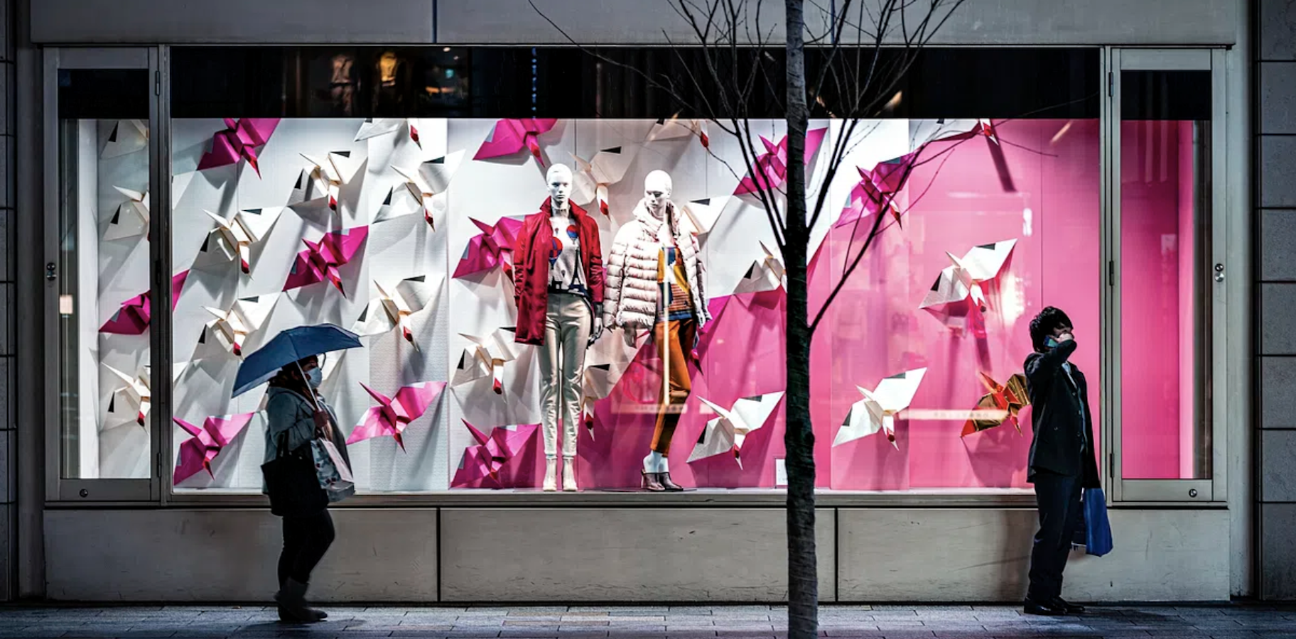
A window display is like an invitation. It captures attention and welcomes potential customers into the store. Retailers often use these spaces to showcase new arrivals, special offers, or a taste of their brand’s essence.
The goal with window displays? Clarity and appeal. It’s essential for onlookers to easily identify what’s on offer. And if they can visualize those products enriching their own lives, even better.
Checkout display
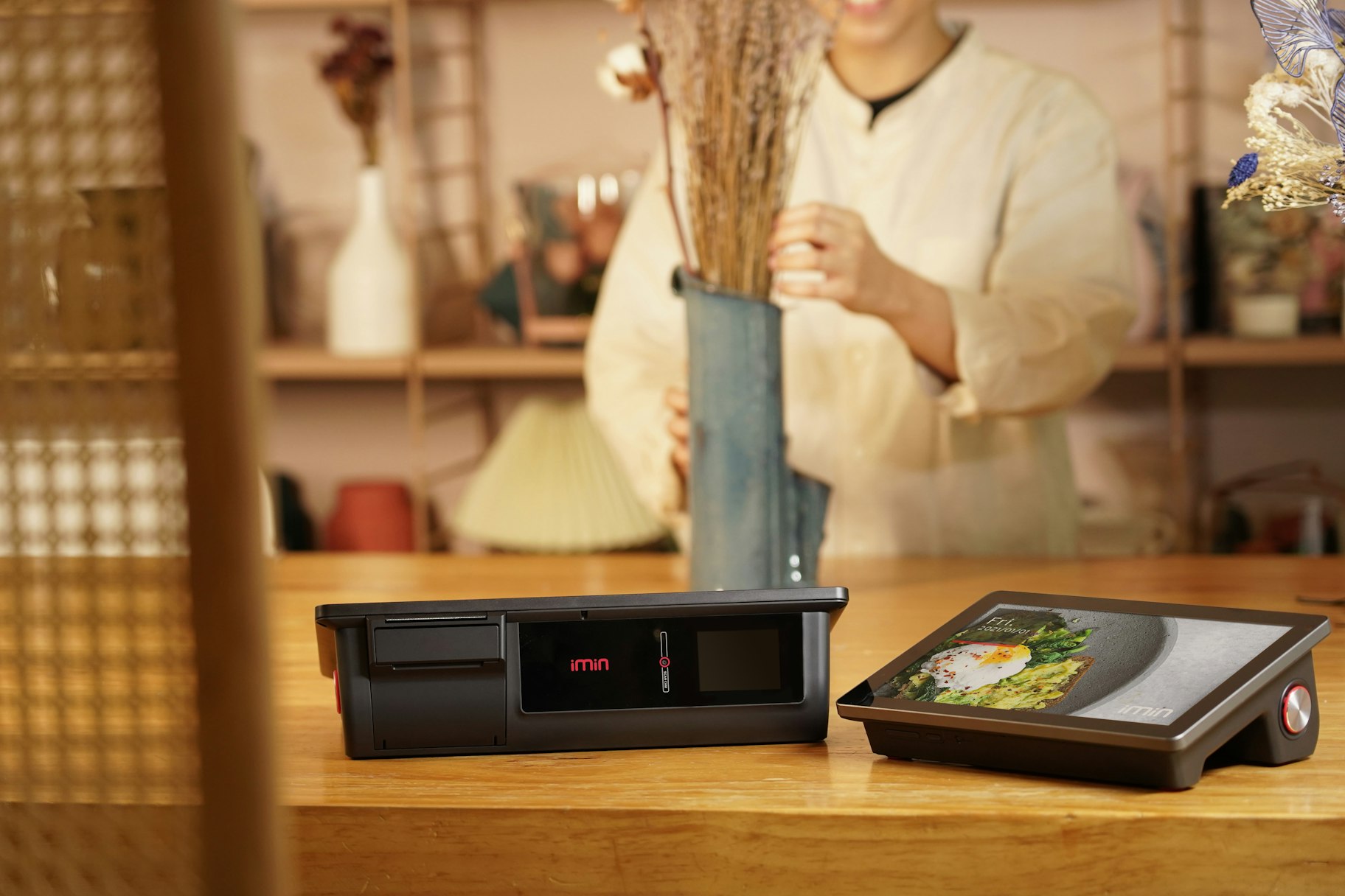
Don’t underestimate the power of the checkout area. It’s not merely a transaction point. It’s an opportunity. The right setup can attract newcomers and trigger last-minute purchases.
Visualize a self-service checkout. Is it reflective of your brand? Does it offer irresistible, affordable add-ons? By optimizing this space, you can boost both customer satisfaction and retail sales.
Interactive displays
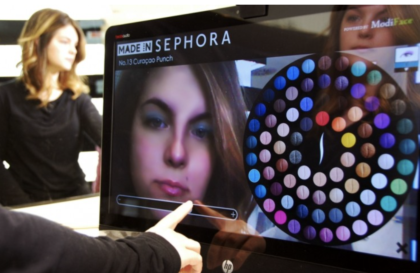
Retailers constantly seek new ways to engage customers, especially as the line between physical or digital environment blurs. One emerging trend is blending physical products with digital interactions. These setups invite customers to interact, offering a more immersive experience in both the tangible and virtual realms.
Options range from interactive mirrors like those found at Sephora to simpler solutions like in-store tablets showcasing product details. You can also have chatbot-assisted product recommendations or customer-curated in-store playlists for a memorable shopping experience.
Mannequins
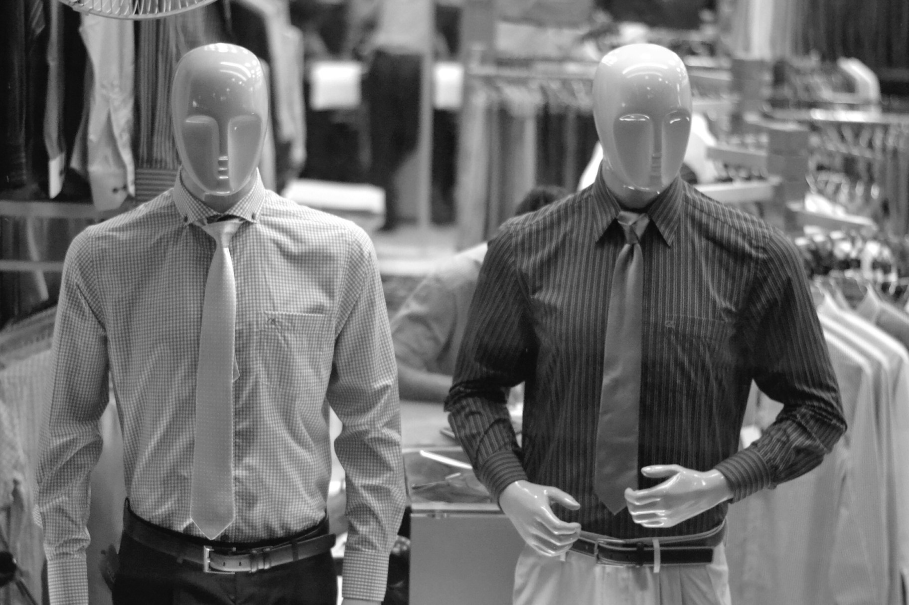
Mannequins remain a favorite. They resemble real-life models, showcasing products in real-world scenarios. Retailers tailor their mannequin choices to resonate with their target audience.
If you’re considering adding mannequins, they come in various styles and prices—typically between $ 50 to $ 500. With diverse sizes and materials available, finding the ideal fit should be a breeze.
Signages
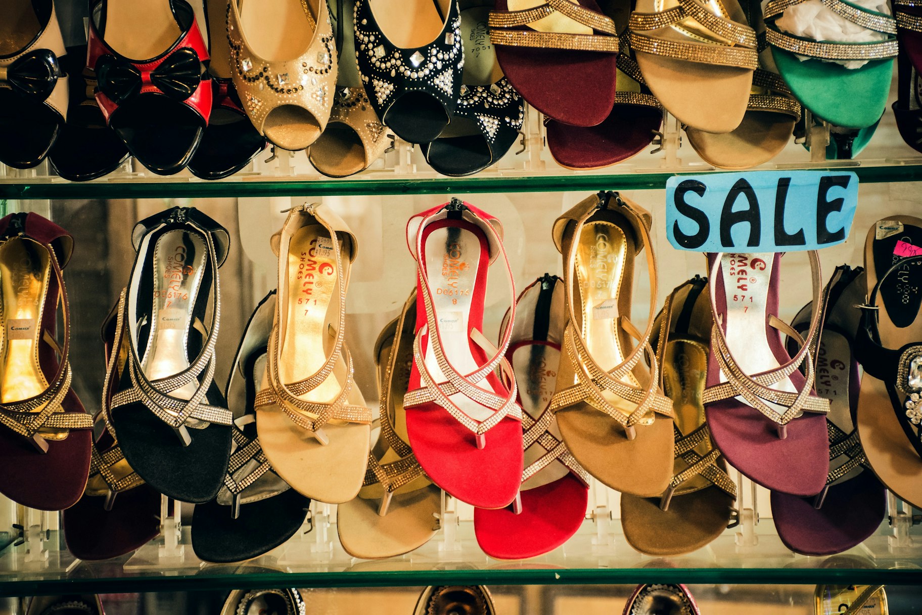
Signs in stores are silent guides. They direct and inform customers every step of the way.
Think about a grocery store. Clear signs might show where the apples come from or the origins of your morning coffee.
Stores use various types of signs, from outdoor ones that showcase promotions to inside ones that provide directions. Safety signs, too, play a crucial role, ensuring that everyone remains safe.
A good tip for retailers? Make signs clear and easy to read. Dark words on a light background usually work well. Also, ensure the design matches your store’s style.
Benefits of visual merchandising
Now that you know what visual merchandising is, let’s look at the benefits of implementing this retail business strategy in a brick-and-mortar setting.
More sales
Imagine walking into a store. What catches your eye often determines what you buy. Visual merchandising plays to this very instinct. By showcasing products in an enticing manner, it triggers those spontaneous buys. The result? Higher sales. Each strategically placed product or eye-catching display nudges shoppers to spend a bit more.
Longer customer visits
Effective visual merchandising strategy does more than just attract customers—it keeps them engaged longer. Think of it as setting up a space where customers naturally want to explore. These crafted in-store experiences lead to what can be called “engagement points.” It’s at these points that customers might pick up a product, test it out, or even imagine it in their own space.
Amplified reach
Today’s shoppers love to share. A striking store layout or a novel product presentation often ends up on social media. As customers click and share, the brand gains visibility without spending a dime on advertising. When a store becomes a backdrop for a social media post, it’s doing something right. It’s not just about the store’s appeal. It’s free marketing that reaches a wide audience.
Key components of visual merchandising
To maximize virtual merchandising’s potential, it’s crucial to grasp its foundational elements. Let’s look at the visual components essential for creating standout displays.
1. Color scheme
Color speaks to your customers. It pulls them in, evokes emotions, and influences purchases. Every store paints its own story with colors. Maybe yours leans on the stark contrast of black against white, or perhaps it’s a soft palette of pinks and reds.
Picking the right shades involves:
- Defining your store’s mood. Earthy tones could work for a boho-chic boutique.
- Understanding your audience. Different groups resonate with different colors.
- Differentiating from competitors. If everyone’s doing blue, consider another hue.
2. Lighting
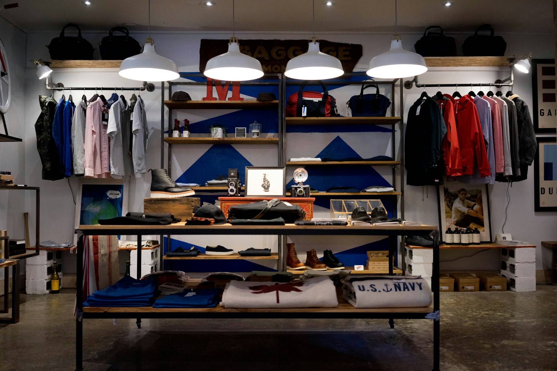
Light can do wonders. It creates ambiance, guides customers, and even sets the mood. Are you aiming for a cozy, homely feel? A vibrant runway-like atmosphere? Or something in between? Lighting can help you achieve it. Spotlights on specific products can direct attention, ensuring your top items don’t go unnoticed.
3. White space
Having areas in your store without design elements is intentional. These spaces, often termed “white space,” provide visual rest. They amplify the importance of products and cut down on visual clutter. Think Apple: its retail stores are a testament to the power of minimalist design.
4. Grouping
Placing similar products together is smart. Not only does it encourage customers to buy more, but it also simplifies their shopping. They don’t need to traverse your entire store searching for related items. It’s efficient and effective. Think about how grocery stores place dips next to chips or how peanut butter often sits beside jams. Group by color, price, size, or type—and watch your sales soar.
5. Rule of three
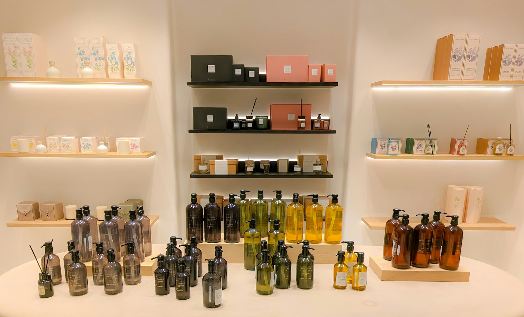
When creating displays, think in threes. Place three products side by side. Maybe you group them by height—short, medium, tall. Asymmetrical arrangements catch the eye and hold attention. It’s different, intriguing, and it makes customers look longer.
How to improve your visual merchandising
Here are five ways you can improve visual merchandising in your retail store:
1. Align every element with your brand’s image
As customers enter, let your brand envelop them. Choose major displays that resonate with your brand’s message, then refine the ambiance with smaller details. For example, in a store dedicated to sustainable living, features like reclaimed wood shelves, upcycled decorations, and a green plant motif can drive the brand’s mission home.
2. Master product placement
Place premium products at eye level. In a clothing store, for example, hang those designer jeans where they catch the eye first. Bundling works wonders too. Pair that summer dress with matching accessories, offering a complete look. Such strategic placements not only enhance the shopping experience but also encourage multiple purchases.
3. Optimize space usage
Maximize every inch of your retail space. Convert unused areas into engaging displays or interactive zones. For instance, transform an overlooked corner with a themed product display. Thoughtful space utilization can surprise and delight shoppers, boosting their interest and engagement.
4. Embrace seasonal displays
Let décor echo the seasons. For instance, in winter, a décor store might showcase festive arrangements. Such thematic setups can ignite shoppers’ festive spirit, prompting seasonal buys. A tip: Rotate your seasonal displays regularly to keep the shopping experience fresh and exciting.
5. Ensure staff knowledge and presentation
Your staff are part of the visual appeal. Ensure they’re well-presented, knowledgeable, and in line with the store’s vibe. For instance, in a high-end boutique, staff dressed in chic attire and offering personalized assistance complement the upscale ambiance.
Win big with visual merchandising
Visual merchandising is more than just making your store look good. It’s about turning every corner of your shop into a conversation with your customers. Use the tips above to create effective store displays, and watch your foot traffic and sales soar to new heights.
Visual merchandising FAQ
What is the goal of visual merchandising?
The primary goal of visual merchandising is to catch a shopper’s eye. This makes them more likely to buy as they are drawn into an attractive and engaging product presentation.
What does a visual merchandiser do?
Visual merchandisers arrange product displays and set up the store layout to draw in customers and increase sales. Their expertise ensures that stores not only look appealing but also function effectively for both shoppers and retailers.
What are the 4 elements of visual merchandising?
- Interior display
- Store interior
- Store exterior
- Store layout
Start selling online now with Shopify
Start your free trial


Want to learn more?
- 9 Marketing Strategies That’ll Level Up Your Ecommerce Store
- 6 Killer Explainer Videos and Tips to Make Your Own
- Guerrilla Marketing: What It is and How to Use It for Ecommerce
- The Ultimate Guide to Experiential Marketing in 2024